Shocking Design Spectrum

I like popular culture a lot. I’m a junkie with respect to it… I also like design, technology, branding, and athletics among lots of other things. And it’s a collision of several of things interests that brought me to want to post this quick entry. I was shocked this morning–when perusing my daily must-hits online–and I stumbled on the following two things back to back.

First thing, I’d not seen before. Second item, I’ve seen many many times, even lusted over, but hadn’t caught the commercial online. These two items and everything they stand for stood so sharply in contrast to one another that I felt compelled to share ‘em…

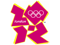
A) The worst logo ever; certainly the worst OLYMPIC logo ever, multiplied by 1000.

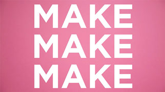
B) One of the more exciting, enticing designs in quite some time:

Regarding A: I can’t believe that the UK Olympic Committee paid 400k British Pounds ($800k dollars) to develop it over the course of a year@ Read what some people think.

Regarding B: I can’t wait till June 29th!!

Isn’t the spectrum in quality of design amazing? These two things juxtaposed seem totally absurd. How could one thing be so crappy and the other so dreamy? The range is amazing.

How much thought have you given your brand/look/functionality/design/effectiveness?

(Saw it first on Seth bright and early this morning, but love the multi-link idea from a few days ago, David)

Related posts:

    Design, Law, Technology, Vodka, and Art – Something For Everyone
    Waiting For iPhone? Get Yours Here First.
    The Best Camera: iPhone App + Book + Community

---
Get my every move: Follow Chase Jarvis on Twitter
Get exclusive content: Become a Fan on Facebook

    14 Responses to “Shocking Design Spectrum”

    1. A.R.Yngve Tuesday - 5th of June, 2007 at 2:12 am #

      Well, at least these two cases show that money alone can’t create good design… or brains. ;)


      “How much thought have you given your brand/ look/ functionality/ design/ effectiveness?”

      I think about this a lot, and try to constantly think of new ways to get good design on a very low budget.

      Remember Punk? The Punk Rock aesthetic was to turn poverty into a design (literally poverty; Johnny Rotten has said in interviews that they couldn’t afford to dress better), and use whatever was at hand — junk, even.

      Perhaps we can learn something from Punk Rock — not that we must dress in garbage if we can avoid it, but to use what’s available creatively.

    2. Jeżu Tuesday - 5th of June, 2007 at 3:09 am #

      Hi Chase… This logo is absolutely scary. :/ It’s a big shame that they want to show something like that to the world… Brrrrr. Shocking.

      By the way, I have enjoyed your “ninjas” thing ;)

    3. David Airey :: Creative Design :: Tuesday - 5th of June, 2007 at 4:05 am #

      The London olympic logo is a travesty.

      There’s so much design talent in the UK that it’s just an embarrassment.

      Whilst Wolff Olins was the agency with the commission, an equal share of the responsibility must go to the client, headed by public figure and althete Seb Coe.

      Since when has Sebastian Coe been a brand strategist? Oh well. Here’s hoping a re-design is soon on the cards after public pressure.

      Thanks for the link, Chase.

    4. Carson Blume Tuesday - 5th of June, 2007 at 1:03 pm #

      The logo makes me sad, the iPhone makes me smile!

    5. Finn McKenty Tuesday - 5th of June, 2007 at 3:16 pm #

      I think the Olympics logo is awesome. It’s different, fresh, energetic, and young- and most of all, hats off to the design manager for having the guts to try something different. I love it that everybody is so up in arms about it. The best work always polarizes people like that.

    6. David Wednesday - 6th of June, 2007 at 9:59 am #

      Regarding the logo, and previous UK marketing moves:

      A few years back, “Great Britain” hired a marketing/PR firm to spruce up their image.

      The result? They were told to drop the “Great.” Just say “Britain.” You don’t need to use the “Great” anymore.

      Cost: ~$1,000,000.00 USD.

      I wish I had the cohones to charge that kind of money for such profound and sophisticated advice. (Sheesh.)

    7. David Wednesday - 6th of June, 2007 at 3:00 pm #

      Uh-oh. Things just went from bad to worse:

      http://news.yahoo.com/s/nm/20070606/sp_nm/britain_olympics_logo_dc

    8. Chase Jarvis Wednesday - 6th of June, 2007 at 9:41 pm #

      A.R.Yngve _ long live Punk Rock. And if the UK Olympics used their 400,000 British Pounds–what was available to them— a little better, they’d have something a little stronger, eh?

    9. Chase Jarvis Wednesday - 6th of June, 2007 at 9:47 pm #

      Finn: I KNEW you’d love this this thing, man! (which is something I love about you!) I love work that tries hard to cut against the grain, for sure. I love it for that, but I gotta think that it might be a joke it’s so poorly done. Risky logo design is one thing, but I’m literally just waiting for the biggest internet hoax ever to be unveiled that we’ve all been punked!

    10. Chase Jarvis Wednesday - 6th of June, 2007 at 9:52 pm #

      David: OMG! That’s something every good logo should do – cause a seizure!

      (seriously, go check out the link David posted…)

    11. Mona Sunday - 8th of July, 2007 at 5:14 pm #

      Oh. That Olympic logo is so depressing…hmm.

      “How much thought have you given your brand/ look/ functionality/ design/ effectiveness?”

      A whole dang lot! My biggest problem, though, is that I am a student and as such I have a lot to learn about the “functionality” part of design…

      Anyway, your work is SO inspiring!! When I see your work I think, “And this is what greatness is…” And then I want to go throw my camera out the window. Heh, heh. But I wish you continued success!

    12. Chase Jarvis Sunday - 15th of July, 2007 at 1:31 pm #

      Thanks for the kind words, Mona. For functionality, you should tune into the design world mags. I subscribe to nearly every one and devour them diligently. the more you review/examine the successful stuff, the more attuned you’ll become.

    13. chris Saturday - 11th of August, 2007 at 10:35 am #

      I read somewhere that the olympics logo looks like lisa simpson giving head. It does.

    14. Chase Jarvis Saturday - 11th of August, 2007 at 8:01 pm #

      Chris: that is hilarious. I see it. Brilliant.

    Leave a Reply