
In the event that you’re an RSS reader, or get this blog via email, I’d love to direct your attention to–and get your feedback on–a refreshed www.chasejarvis.com. Pop outta that reader and pay me a visit if you’ve got a minute.
A brief tour, highlights by page:
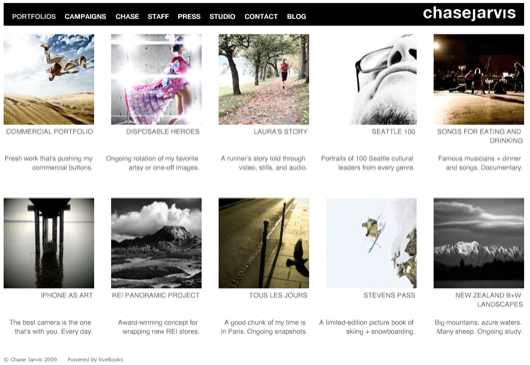
_Portfolio section now has an ‘s’ on the end of it: PORTFOLIOS. Showing way more work and happy about it. Revived some old favorites, tossed in some new grimy. Some vids. This will now get updates much more regularly. We’ve got a bunch of stuff in the hopper and I’m taking a lot of photos these days…
_Campaigns. Couple changes, but his will get updated with more fresh stuff soon.
_Chase. New bio vid, new pics, complete with me drinking beer at my 1st birthday. (I hate doing these things, but Cody makes me.)
_Staff. No change. (But check ‘em out if you haven’t watched their bio vids. Simply amazing group of dudes and dudettes. Love em. Take note of our newest member, Mikal the producer. At one point she actually says “everyone here is pretty nice”. Pretty nice?)
_Press. Unabashed promo. Skip this if you can’t stomach it. I’ll understand completely.
_Studio. Refreshed vid. Can’t really call it our new studio and show a vid of us building it out anymore. As such, Cody whipped together some B-roll and some stills for this facelift.
_Contact. Got a new phone number for Paris. My SIM died and couldn’t connect with the carrier, Orange, in time to preserve the old one. C’est la vie.
_Blog. Keep on truckin’. Added a search bar so you can find obscure references to Ninjas, iPhones, 1968, Pearl Jam, bikinis, RWAV, D90, D3x, Strobist, Laforet, Jackanory, APE, RAW, etc.
_Logo. I hate logos. Well, let’s say I struggle with logos for photographers. I’ve racked brains with smart friends David Airey and Finn McKenty in the past to come up with something I could stomach. In the end we’ve just taken their great lead, stripped it to a font-based mark, and removed the dots above the j and the i for a little mojo. Tossed in kerning tweak. It’s not a logo, it’s a name. And I finally like it.
Big thanks to my host liveBooks (big images, fast – tell them I sent you) for helping up update the site and Dartanyon, our in-house guru.
Now having said all that, hit me with some feedback. Happy Wednesday.
[and thanks for all of those Twitter friends who have already chirped me @chasejarvis with the feedback!]
–


Looking good Chase. The best part (for me) is you’ve given me a couple of ideas for my own site. I like the new studio vid – I’m hoping to be putting together my own in the next 12-18 months so it’s good to see what my betters are doing
Thanks for sharing.
I love it. I think it looks smooth, and love that there’s more content all contained within the same pleasingly minimal and compact format.
Any opportunity to see more of your work is going to get a thumbs up from me.
Love your photography and your site! Very inspiring!
Sick. Nice clean look. I love the Blog the most though I have to say. Gives us tons of insight into your life as a photographer, and I thank you for sharing.
Works well, never fails to amaze me what great service these simple platforms provide
The PortfolioS section is great! Bravo.
Chase I love your work, however the big black header and your new logo are not doing it for me. I think you should stick with your old logo and drop the black bar but keep the new layout of the site.
Looks real purdy. Thanks for inspiring us all.
Favorite part of this all is the Laura vid.
Also looks like you adjusted the kerning on the logo vs what you had a few days ago, much better.
I do feel like the older logo was slightly stronger than the new one, but I do understand change.
What a great site. Simple and to the point. The images are awesome and they totally showcase how diverse a shooter you are.
Can I just say that I love your studio? Ok, I’m jealous. It’s a goal of mine to own my own studio work/live space, loft style someday. My day will come!
Your site is simple, clean, and easy to navigate = the focus is on your work and that’s what counts.
Chase, I LOVE your photography and all the new updates. You’re an inspiration to me. However, I don’t like the new chase jarvis logo in the upper right of the page. Your work is better than your logo. It works, but I think it could be stronger and help you more. Sorry, just giving some honest feedback. I’m a huge fan!
I like the new header, and the site looks good
one thing, maybe it’s just in safari 4, but, the main page, it is cycling through the 4 pictures really quickly. I’d say about 2 seconds on each. I don’t know if that’s what you planned, but seems kinda spastic.
it’s the same in firefox, so it might be planned. I don’t know, seems like its cycling through too fast
Under REI Panaramic, images 4 and 5 from the right have a transition where the mountain is well lit on the left, and dark on the right. I know it’s two pictures, but it lines seem to flow like it’s one. Confused my small brain. I would personally consider changing that order.
Other than that, nice! I like all the extra portfolios to peruse. I had no idea you had such a large body of work.
1)the site refresh, the navigation bar’s text is not crisp on the black background, its a little blurred?
2) the navigation bar changes its shits position on different pages- not a good user experience. should be fixed
cheers
also chirped you
wondering why I’m not in your Seattle 100
lols
I know it’s awesome, you know it’s awesome, so I’m going to suggest 2 things;
1. There is no info on a lot of your photos in the portfolios. There’s an info button, but it just pops up your name, no location/client/etc context. May not be relevant to clients, but I was curious.
2. I know it’s rude to publicly nitpick but there is a tiny typo on the staff page and I will go crazy if I don’t say something. “Amateur” under Mikal’s photo is spelled wrong.
The site is clean, smooth, animated without being obtrusive, and sexay. Keep it up!
Great stuff Chase and Team. Love the new layout with new pics and vids. really like how you change the top nav bar to black but still keep the cleanness of the original site. your new bio vid is really great and refreshing. niiiice!
I wrote it earlier, but you’ve made a hudge leap forward with this and the previous refresh. I used to think you’re a simple sell-out, but boy, how wrong I was. You’ve build a solid reputation with this new folio and new bio vid. The previous one was abysmal, you made a fool of yourself by the kind of talk you used. Now you seem like an acomplished photographer who admits you have to make some compromises to make it for a living, yet have some solid personal projects.
It’s really good you shed that ‘pop-culture-junkee’ style, and focused more on the web. That was a garden path thinking, imo. For the people who really know something about the photography, you sounded silly, and for the people who didn’t even hear the names like andy warhol, it sounded like you showed off, so that was the main culprit of your low credability, for me.
so, the changes are very cool, and don’t make the same mistakes anymore. you’ve got sufficiently impressive folio right now, that you can easily admit sometimes you need to get a little bit closer to one or other company to make a decent living, and that’s totally understandable and fine. The problem just arises when someone becomes a hypocryt.. So why to lie about the nikon d90 or other stuff? Just say, nikon asked you to do some promo shots for their campaign. You don’t have to lie you make some ‘other project’, totally unncessary. Just be real and you will gain even more respect. Nobody’s perfect.
Hey Chase – I think from the navigation bar down is awesome and reflects who you are and your team are as professionals. As a website designer i have come to the conclusion that a portfolio should let the work speak for itself without anything taking the users attention away from the work. I don’t think that this bar does anything for you. Why black? I didn’t even notice the treatment to your name until you said something. The other site was much more refined and clean. Just my thoughts.
I love your site! Simplicity and awesomeness combined.
Ali
Unfortunately Livebioks = Flash, which = no love on the iPhone. A bigshot like you should have an iPhone optimized version of your site, and have it auto-detect so we don’t have to click extra links to get an HTML version of the site.
Just a thought.
There goes my hero….watch him as he goes!
Dude. I have never seen anything from your seattle 100 port. I think they might be my new favorite. amazing work.
Peace Love Joy
-Braun
Looks great… I love it.
As someone who has been looking to get a site going and having checked out Livebooks, the things I dislike are the apparent slowness of loading and especially the annoying scroll bar. It makes me focus my attention on where my mouse is to keep it from scrolling instead of looking at the photo. I’d rather the thumbnails be always visible and not covering the large photo to necessitate faster browsing. Did I meantion slowness of loading. Every Livebooks site is like this it seems.
I do like the layout and description of the portfolios page.
Brian P
Inspiring as always and the new content is great!
Just a thought…might be fun to see an iPhone Photos section of your favorite iPhone captures. Maybe for future updates to the site.
Cheers!
twitter.com/ronicadesign
New portfolios look great! Love the Disposable Heros portfolio. Don’t care much for the new logo.
The new site gives me a new sense of you. The same Chase Jarvis that is accessible, open and fun but with the added bonus that it now also feels (at least to me) like a bigger company. And I mean that in a good way. A lot of people don’t realize the amount or work, money and dedication needed to get to where you are.
I really like the new logotype, the portfolio section and your bio-video. I guess the only thing that feels a bit heavy is the black header bar. That may just be me though.
Congratulations an all your success and thanks for the inspiration.
Looks amazing, especially the disposable heroes port.
Chase,
I saw the update a few days ago, with the old header. If I were you I will keep it. I am not really liking this new black header, the white one you had was really cool. Maybe the Chase Jarvis previous logo was a typo provided by livebooks (just trying to know why you changed it).
Ok that was the bad point. I really like the portfolio now, lot of stuff to look at, and it is all about quality. The new video presentation is really cool too.
My point is everything is really nice and better now, but I hope you will go back to the previous header
Take care,
Nicolas.
Nice layout!!! The updates are great. The new videos are sweet. Awesome work.
Great stuff all around. Everything screams versatility, diversity and creativity. It’s not so much your work, excellent as it is, it’s how you’ve managed to market yourself that really shines. You are creative in everything you do… including the way you approach ideas and concepts. Great work man, love everything about the refreshed site.
overall, the diversity of work speaks volumes for itself.
Chase, like the portfolios section and I see you’ve been to NZ.
If you’re ever this way again and need a guide or someone to make some cofee while you shoot, I’d be honoured.
nice, I like the portfolios section, much better than the old one…
A few days ago I already noticed the changes and announced them on my german photography blog: http://blog.visuellegedanken.de/index.php/2009-03-09/neues-auf-chasejarviscom/
I really like that you show more photos than before and the new vids are amazing!
I really like the site improvements, especially the new vids.
congrats!
Nir
The new design looks fantastic. It is just clean & simple. Less is more. And you got it. You put every usable form of self-marketing in, pictures of your work, moving pictures, some text & you are linking to all the social communities. I especally like the black bar on top of the page and that you put your name on the right side of the black bar.
I'd really to see some pictures of your real life marketing tools. Especailly of your visiting cards & other stuff like that.
Thank you for sharing & being such inspiring person!
The new content is Great, Chase. The black ribbon on top of white pages has, for most of us Europeans, somehow a funeral look. Why not a “positive” version of the menu bar?
Massimo
Looking great. I especially like the new Chase vid, gives a real personal insight into the man behind the camera, a real appealer to both admirers and potential clients I’m sure. The portfolio also comes across as really strong and impacting.
I’m a big fan of David’s work but confess I’m not loving the new Chase logo or it’s vertical alignment in the header, I do however like the impact of the black background. Not sure about the ‘s’ on portfolio, but that’s a whole debate on its own!
Thanks for the insight, fascinating and educating in the same breath
Great site Chase, loved seeing more of your campaign work. And like a few others am feeling rather envious of your amazing studio space
Inspiration to all who love images of any sort. Helen
Great stuff, I love the 100 Seattle portraits and the iphone section.
Spotted a small typo: there is a missing “a” in the “but we do have gorgeous” sentence in the Studio section.
Thought you might want to know.
Very nice Chase. Your work is inspiring and fresh! I could see only one thing that I would change. The menu bar on the top should stay fixed while the page should move up and down. Just to be more user friendly, no big deal. Have a great day and keep up the GREAT work!!!!
Louis
Great work as always, Chase. The new layout is pretty smooth too. I’ll be honest though, I noticed the updates a few days ago, and until you mentioned the j and i dot removal in your blog post I thought it was some sorta mistake, either with how my comp was viewing the page or just a livebooks’ ooops. But now that I know it looks pretty tight white on black.
Looking good Chase. Have to admit I got a lot of inspiration from your site when I refreshed mine back in January.
I did notice however, the variables in the url when you go from page to page… have your web guru hide that stuff by using url rewriting. It’ll look much cleaner.
Keep on ROCKIN it!
Everything is great, except that it is flash. I don’t like flash. You can do amazing things with css, so why flash?
I think the photos on the front page rotate too fast. And to me they look a little bit too over processes, maybe its the look your going for but just my opinion.
Otherwise great!
The refresh is great, I love seeing consistent updates in the meat of a creative’s site.
I really enjoy the deeper look into the campaigns and projects you’ve been working on. I find that kind of info as valuable as anything. Knowing what one of the upper-echelon photogs is currently working on helps keep us all on top of the trends.
Cody deserves mad props for putting together such slick vids, he does nice work. Stylistically I wouldn’t change a thing about them.
I totally agree with you about the “logo” struggles. I use my name as my “logo” and it’s always tough to get it right. I think you guys nailed it with the current rendition, it reads well and it’s got a keen edge.
Overall I’d say it’s a great success.
Cheers,
Nicholas
Groovy new look!
Love the new look and feature set – and your new bio video. As a photographer and designer I’m not crazy about the logo but it feels very integrated with the site and a subtle change. As we all know its all in the details :]
Awesome and streamlined. The only thing that bugs me is the speed of the initial slideshow. It seems that if these are the first images you want people to see, they should have a bit more time to see them. Overall, love it though.
Thanks for all the feedback, everyone. Please keep it coming. The constructive stuff is all being considered for sure and kudos feel nice. Grazie…
Chase, I like the new site, but the images are a bit smallish. Maybe my large screen? Thought in the past it had larger images? Dunno.
Like some of the new port image choices.
Love the new bio vid.
Laura’s story is a neat compilation and inspiring as a photographer. (I just got my hands on the new 5D MK II and will be shooting some Triathlon/Sport footage this week during a shoot. Great inspiration for that upcoming project.)
All that said, the site is lacking in the “non flash” version. I’ll be blunt, as it is a LiveBooks site, it TANKS on the iPhone/mobile presentation…you need to push LB to make their sites work for the iPhone. All the artists using them should be screaming for that now.
The popularity of mobile computing devices (namely the iPhone) is gaining major headway in how people interact on the net…be it Twittering, e-mail or surfing.
There was a comment an art director made to me as I pulled it up at the studio earlier. She asked me about you and your site so I sent her the link, she said it was a mess, so she gave up.
Not being able to see it as a mobile site is a bit annoying knowing the strides in technology you’re making elsewhere.
Just a thought. – Overall – Great changes! Keep on Keepin on bro!
Totally wicked!
here’s my two cents:
disposable heroes: I feel like the flow gets stopped by some of the images that are not part of a series and just in between series alone. also some images from series are separated.
panoramic: the flash panning is just hectic! these are stunning, stand alone images. the panning makes me crazy
stevens pass: good stuff in there for sure, but you need to kick out some whack action shots!
and that’s about it. I’m stoked on pretty much the rest and that is a lot! so hats off man!
Loving the additional content!
Wish more photographers would adapt the minimalist approach when it comes to Web sites. Put the focus on the work, and not the site.
Awesome!
i really like your new website. when i first saw the black menu bar, i wondered why you changed the clear grey/white design, but now it’s finished and it works great. i also like your new bio vid and the new impressions of your studio. what architect built it? (i’m studying architecture, so i have to ask this. maybe the answer is in one of the comments above, but there are too many to read them all
one thing i also like on the new design is, that it runs faster on my mac
but there is one thing i don’t understand: why don’t you like logos? i think your older one worked better (because it was more consistent concerning to your meaning that you prefer a lettering), but i understand to change some time.
keep on working. i just love your work and thanks for sharing it!!!!!!!!!
Only thing that bothers me is the nav on the blog. It looks like it’s the same as the one from the website except sized up a bit. This makes the text in the nav look a little fuzzy. Everything else looks fine to me though. Diggin all the new content.
Love the new look. I understand why your video is the way it is, but love the ones about your staff still better (they are quirkier and have a “personality” but as I say I understand why yours is the way yours is (it is a business developent tool).
Chase, I’m a huge fan of your art; it is truly inspiring! Sorry not trying to ride your nuts, but your photography just has amazing vision. As for the site I really enjoy the new menus this has a good flow. The new studio vid is sick; I would change back to your original LOGO though. It just seemed to have a stronger presences, other than that man it’s gravy.
k e i t h
I think the pano’s would look better if you could see the whole image at once even if that means they have to be smaller, rather than scrolling through horizontally. Great photos!
while i like that you are refreshing things, i'm not a fan of livebooks. for MANY reasons, which i may have even said before the last time you had them update your site.
if you're going to be spending thousands of dollars on a site, why not go completely custom, from a design-focused, bad ass company. not a company that starts off with a template system and nickle & dimes on every little detail.
now that could all be moot if they did the site for free so that they could say "we did chase jarvis' website". then i guess that's cool. i wonder why with the level of product that you and your entire team put out consistently, why it is that the website blends in with almost any other photographer's site ( who's running livebooks of course ) and it falls short in that area.
you've settled for a website template and that's disheartening.
rocksteady,
danno~
everything is “chase jarvis” – the part that makes the site (for me) is the chase jarvis “insight” vid…
really nice touch and makes you even more approachable….
cheers,
your friend from oz,
Cal.
Great update! I really enjoy the choices that are immediately on the first page. You are going straight to you work. Good stuff. I am thinking about getting a livebooks account, it seems like it is fairly easy to manage.
I dig the new look. The simplified bar at the top is killer…. the new additions to the portfolio are superb…. I mean right on the money.
I read a comment on this post that seemed to talk down your past portfolio. I wouldn’t say I agree with him, but he brought up a good point. It seemed you played down the range of your portfolio. He blamed it on not “selling out”, which whatever…. take with a grain of salt.
More than not selling out, I love it when someone can say … ” Ok. I have to make concessions to make money.” and then makes the “system” work for them. Taking pics of ninjas, highly produced actions shots, and mid-air dance moves in the desert are examples of being FREAKING intersting and cool while still photoshoping the crap out of a photo. Sure its produced and not real, but its crisp, interesting, and engaging. Boiled down… visitors can now see your range. That is cool.
BTW… Livebook sites rock cos they are stable, realible and efficent. So sick of everyone preaching customize, customize, customize when half the “custom” sites I visit never work. Glitchiness is bad biz.
I know it’s not about the .com but about the blog, anyway the rss is not working ATM :S
The new portfolios are great, I’m especially intrigued by the running short. Can we get some insight into this project on a future blog post?
BB
I like the additional portfolios! I use your site for examples and material for my high school photography class from time to time. Your blog stuff is incredible teaching resource also. Thanks!
Laura’s story is very cool, great photography, makes me want to start running again!
Love the panoramas, my favorite set though is your Seattle 100 portrait series. Those are really really great. I’ve been studying people like Richard Avedon, trying to get better at my environmental portraits. This Seattle 100 is very inspiring, the risks you are taking with these gives me confidence. The one I like the best is of the three guys and the one on the left is slipping backward with his drink. I love the hole in the middle guy’s boot, the poses, the blown out backdrop, light shadow. It’s cool this set is b/w too. Again, love this set.
Great breadth of content l
Just took a few minutes out of my day and toured the updated site. Very well executed -it’s a clean presentation that retains the poetry. Hats off to you and the team.
I love the more content but I preferred the overall look of the site before… to me the black bar doesn’t do it for me… Plus I absolutely loved the two toned logo you used on the site before and wish you would have kept it going. Go with the old style but added content
~Nick Nieto
My Photos
I am a new fan, so I am not familiar with the ‘unrefreshed’ site, but I do like what you have here. Very modern. Simple. Lovely. – - Alanna
like the new portfolio main page plus allowing people to print the images is a great feature that I just added as well. It’s nice to add your branding to the prints something you can’t do if they just right click the images.
The content update is great. I must say though I preferred the white navigation not the black. It was cleaner. Sill I’ve been told I don’t do very well with change so it could be just me!
Your site was great before; now it’s better. Livebooks made my site as well, and I agree that they’re very helpful. creative and very quick.
Having four quick images animating in succession when the site launches is good because it’s obvious it’s not a portfolio slideshow. Mine’s got 8 s-l-o-w images and people might that’s the portfolio, look at the slideshow and go somewhere else.
Of course having links to your blog, studio info, etc. is great and reinforces the seriousness of your operation.
Having the same look and feel on your blog and website works well, of course (I wish I knew how do do that. With a sprinkling of cash money, I suppose). Ditto the ‘Press’ area. Looks right, works perfectly.
I’m jealous of your portfolio thumbnails. That’s a great idea.
The panoramic portfolio is incredible. Was that something that livebooks offers or special code written for you.
Love the Paris portfolio, esp. Place des Vosges at dusk.
I’d like to know your reasoning for having a ‘print’ function so people can print out images. I haven’t tried it so don’t know how good the quality is, but perhaps it’s useful for potential clients to print a selection of images to show their clients. I use the pdf function, but that makes a pdf of a whole portfolio, which I suppose can be printed from.
I wouldn’t change a thing.
Regards
Richard Lewisohn
http://www.lewisohn.co.uk
Great new layout and design. Like the new portfolios but I’m afraid to say that the logo stinks.
Overall, I think it’s a great improvement. I love the videos (chase/studio) and the staff section. The site communicates clearly and embodies the openness that you have in your blog. The only thing I don’t like is the navigation for the individual portfolios (the side slide-out), which I believe didn’t change. It is slow to load and just feels clunky and obtrusive. I would put a thumbnail navigation on the bottom if possible.
On a side note, you and your team rock. Your open communication is refreshing!
Great remodel, just one ISSUE which you may have already noticed…
The browser "Back" button seems to work when going between flash URIs and resource URLs but not between flash pages themselves.
Perhaps you can get the flash pages to work while still using URL resources to chasejarvis.com like: /staff/scott or /chase instead of /#s=0&mi;=1&pt;=0π=4&p;=-1&a;=0&at;=0 if possible. =)
Hey Chase . . . the new site layout and additions are great, except for one little thing. The old Chase Jarvis logo was so much better. It had such understated style. You’ve got a great name, but the new design is kind of blah. Don’t be offended. The site as a whole rocks.
i am very impressed by pictures more than site looks
can you please tell me the main 4 images all has some what halftone color effect is that added in post production or is there any way to shoot it like that
please do reply it would me great addition to my amateur skills
Too many comments to read to know if I’m repeating something somebody already said, but …
The ‘j’ in Jarvis falls uncomfortably between the pixels, and thus feels both too light and blurry. Fatten and sharpen it up by lightening up the mid-grey (Australian spelling) row of pixels on the right hand side of the vertical part of the letter.
(And for what it’s worth whilst I love simple black and white Helvetica/Arial sites like Khoi Vinh’s subtraction I felt your previous logotype was a more interesting and sophisticated use of the shapes that make up the letters in your name)
Hey Chase… personally, I love the extra wealth of imagery now on your site, really shows your versatility and widening creative boundaries.. however, perhaps of more interest is the reaction of someone else who took time to look through it with me the other night, my 9 year old son.
He has a very strong artistic leaning, mainly drawing, painting and making things but also in possession of his first camera that he got for his 9th birthday. He sits next to me Satuday evening and asks what I was looking at on my laptop. I explained it was the website of one of my favourite photographers…
“One of your favourites?” he asks.
“Actually, probably my favourite,” I say
“But he can’t be your favourite, that should be you!”
A nice thought, to be sure, and very sweet of him to say, but I suggest to him that Chase Jarvis is just a smidgeon better than me, in typical understated English fashion
He looked incredulous…
“Okay then,” I say, “let’s go through Chase’s pictures and you tell me when you see one that I can do better than…”
Eagerly, he agrees. And so we begin… These were some of his reactions:
“Wow!!”
“Woah!!”
“That’s just brilliant!!”
“Oh cool! Ninjas!!! Why don’t you have Ninjas dad?”
Finally, he finished with a “Yeah, you’re right dad. He’s much better than you”…
Okay, so he’s not an advertising exec, art director or potential client – yet
– but I have a sneaking suspicion that you’ve inspired one 9 year old boy to further explore his own creative ambitions as well as becoming the first photographer whose name he knows.
I don’t think that’s too shabby a consequence for a website re-vamp
(ps… I’m glad you’ve incorporated a couple of the Ninja shots too)
Following up my previous comment …
Chase, I have just emailed an alternate version of your logo. I created it in Photoshop using a different anti-aliasing method for the type than that used for the logo as it currently appears on your site (Crisp v Sharp).
I think it is both more aesthetically pleasing and more faithful to the typeface’s classic form.
You are most welcome to use it if you agree.
Oh, and for those few that might be interested, the missing dots above the ‘i’ and ‘j’ are properly called ‘tittles’
@ aru: once you get a balanced RAW capture, it’s all done in post production using Aperture and Photoshop.
@ mark: great story – thanks so much for sharing. kicked my day off with a smile…
Hey, I’m glad it did Chase… a smile is always the best way to start the day, whether it’s your own or being greeted with someone elses
Now I gotta shoot some ninjas so my son will think I’m cool!
wow! is that a photography? i like it.. cool pictures..
Chase,
I’m loving the non logo – am a real sucky for whitespaces and simple designs.
Great, great writing and awesome blog post ideas, googled d90 review and stumbled into your blog and now am a new fan.
keep up the great work.
Hey Chase,
I think I preferred the gray better…oh well.
However you REI Panoramic Project is so tight! I work with large-format digital printing and high performance vinyls at my job and this project is something I have dreaming about for a very long time, it is one of my goals in life…and now I see you’ve done it! Awesome work!
Great writings and I love the blog – thanks for sharing everything…
glad somebody is loving the non-logo
Love your refreshed site, love your work. MY ONLY COMMENT : under Seattle 100 where you have portraits of people it would be nice to know who they are and what makes them special!
Hi Chase,
I’m diggin’ the new website. However, one thing you might want to look at is the speed of the transitions on the first page. While I could just go to the portfolios to look at the image, I’d still like it if I could have a little time to see the photos before the next one comes up.
Cheers.
James
Hi Chase, Scott and Co. ,
nice job! I like it very much.
Just a curiosity, I like a lot the presentation video about “chase” and I want to ask you about the music of the video. Is it Mogwai or you composed it? ‘Cause I love that soundtrack. Thanks in advance.
Regards,
Ken