—
Since each of my staff are experts in their own right, fielding a growing amount of questions from you fine folks–and it’s nice to get a change in perspective–you’ll be seeing more and more posts from these talented people in weeks and months to come. Today, Scott takes the reins and answers a popular question about making great black & white images, with a case study to show you how. Take it away Scotty…
—
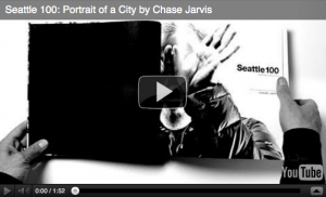
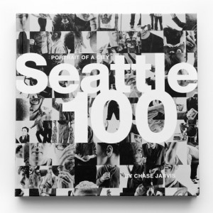
The world is not black and white…but the Seattle 100 post production is.
Following up on the popular guest blog post I penned about the sand jumper image, I thought I’d use this platform to respond to the string of questions I’ve been getting about how we got the striking high contrast black and white aesthetic in the Seattle 100 project.
In the tradition of this blog, this is not going to be a tutorial, rather a theoretical discussion with some visual aids to help illustrate. Post production, like photography is a vast set of tools which give an artist infinite ways to arrive at a finished product. Do not get caught up in the tools, they’re just tools.
Glad that’s out of the way. Now, here’s the theory of the Seattle 100 post production…
-
Make the whites white and the blacks black.
Emphasize interesting textures and features.
De-emphasize distracting textures or features (see #1).
Build contrast by adding layers (this can be very incremental).
Black and white is a friendly medium, don’t be afraid.
‘Because it looks cool’ is a perfectly acceptable reason to do something.
Now a bit of the nitty gritty. I’ll dissect the layers briefly in order to illustrate the concept of creating real blacks and whites, and building contrast with layering. Before any of that is done there is a quick retouch process to remove surface blemishes. Since these are portraits and not glamour shots, the point of the retouching is just to be friendly with little bumps and blemishes, not to change the character or structure of the person in the image.
Next comes the conversion from color to black and white. I used a black and white adjustment layer set to yellow filter. The yellow and red filters tend to be very kind to skin, and generate strong contrast, a good initial starting point.

Converted to monochrome with black & white adjustment layer set to yellow filter. Yellow filter helps to make smooth skin.
The rest of the final look is developed using only a series of levels and curves layers with some strategic use of masking in order to emphasize the good and hide the bad.
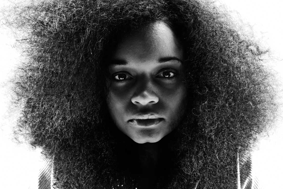
Take a look at the series of images. On one hand, there is a drastic difference in terms of the impact of the image. On the other hand, all of the elements were there in the original. The direct striking gaze, the smooth dark skin framed in darkness, the exquisite wild hair. All of the post production efforts were aimed at enhancing the image by drawing the eye to the most compelling parts of the portrait.
If you were to pick this image apart you’d find that the blacks are very much black, there’s no data in the areas that appear black. The same goes for the white. Those tones serve as the absence of detail so that your attention is drawn to the person in the frame. Conversely, you’ll also find that there is detail in every single pixel of her skin, eyes, nose, and lips. These are the areas that Chase was working hard to capture in the image, and those are the areas that are highlighted in the post production.
Each final image in the book was given it’s own custom retouching, and the techniques varied quite a bit depending on the person and circumstances. What did not vary was the aesthetic concept, which served as a constant guide in both the photographic and post production processes. The real trick is not to figure out the how, there are always a thousand ways from A to B. I could have substituted channel mixer layers, dodging and burning, retouch brushes in Aperture, etc. for the curves and levels techniques I used. The real key is to develop a vision, and then do whatever works for you in order to execute. To check out the rest of the Seattle 100 images visit www.chasejarvis.com/seattle100.
Scott Rinckenberger


Scott, many thanks for this. A pleasure to be able to take advice and hints from a real master of his trade.
Cheers
I’m no expert. But I would have done this before PP by using lights.
Show me how to get the eyes that white with lighting and I’m all over it.
Scott, Awesome post. Nice to see some simple stuff that can be done in post to get images that are simple but yet so compelling at the same time
David, I would have just left your second sentence off and taken the advice.
I’m quite sure they know what they’re doing.
-or-
By just including only the second sentence, we could have deciphered the first.
Very nice, endresult is great! Shot was very good as well!
“Make the whites white and the blacks black” – pretty much sums it all up in one sentence.
as a black photographer, i’m perhaps more sensitive to changing the tone of my subject’s skin color for the sake of art. i like my b/w photos hot. whare do you draw the line? i love this photos btw.
Kafi,
Interesting question, especially in the context of this example image. The simple act of using the yellow filter as opposed to the blue when making the black and white conversion had a drastic effect on her skin color (a blue filter would have made it very dark). I usually try to create a pleasing skintone that is true to the subject, and in portrait photography I definitely avoid making moves that alter the look of the person in the image.
Thanks for the tutorial.
Judging by the original, I think you might have fallen short if you’re intent was to “avoid making moves that alter the look of the person in the image.”
I really don’t think the final image is “true to the subject.”
just my 2¢…flame away…
That’s great! Never knew about sharpening with a high pass filter before.
I love Step 2.
I would have stopped right there!
But then again I am not an artist.
Dan
Thank you both. I try to experiment with this method. Great!
enjoyable read…. i enjoyed how this post didnt go super heavy into the technical aspect of post. just a nice n’ easy overview of how it was done and more importantly a lesson share on artistic vision.
good stuff
Hi Scott thanks for the teaching.
I have have a problem. I have ordered the seattle 100 from amazon 2 months ago. And still i didnt get the book. I dont know whom shall i ask about it. i cannot any email address to contact and track the book. Do u have Amazons email address or a number that i can contact them and ask about my book?
I have searched whole the book stores in Dubai for Seattle 100 but i couldnt find it.
Thank you.
Ahmad,
Very sorry to hear that you are having trouble receiving your book. Unfortunately we do not have any direct contact with Amazon. Here is a link to their customer service page which has a button marked “Where’s my stuff?” Hope this helps.
I appreciate your explanation. Thank you:)
“‘Because it looks cool’ is a perfectly acceptable reason to do something.”
You’re probably gonna get some flack over that but I totally agree with the entire post.
I liked the details of the conversion but what I really liked was the ajax image viewer.
Excellent post, keep this type of stuff coming. Love the look inside the vision and the technique. Almost like an example out of a Craft & Vision ebook.♠
Thanks alot Scott. This will help me a lot in future editing
Hmmmmmm looks I have lots to learn about b&w conversion.
thanks for sharing the pro tips, it always good to learn new techniques from pros such as urself.
Nice work Scott and props to Chase for highlighting the team effort it takes to fully realize his vision. Once I figured out that I didn’t have to make all of my contrast adjustments with one curve my images got a lot stronger. Learning to ignore the screaming blinkies in certain shadow and highlight regions made them stronger still. Personally I think those are two of the strongest points you re-validated for me with this post. Thanks!
Why don’t use Aperture to get your images in black & white?
Eliano,
Great question. In this photo, Aperture 3 would have done a great job. In a number of other images that we selected for the Seattle 100 book we had a need to do some more complex retouching that was best suited for Photoshop, although that line is continually getting pushed toward Aperture. I generally look at a project as a whole and go with the software solution that will cover all of the bases.
Thanks for sharing! B&W are my favorite
Scott, love the post mate!!! Note to Chase: We need to see more of Scotts amazing post production! Note to Scott, do you do the Color correction(b/w) for Chase’s video, cos that is great too, and we would loved to see you post that too. Note to chase again: we love you and the team dude! Thanks for sharing.
Rahim
Thanks for your expertise….nice to see and hear how things are done.
Thanks for sharing your process, Scott!
Just so I’m clear, in all of the steps you mention, you’re making new adjustment layers, right? So you have multiple Curves and Levels layers? I’m fairly new to adjustment layers and still figuring out what I can do with them.
Claire,
You’re right on the mark. I’m making new adjustment layers. This helps to build more depth in the blacks and whites, and each layer is fine tunable via masking, opacity, blend modes, etc. Once you have a grasp on the layers concept, you’ll be unstoppable in PS.
Sick stuff! I love Black and white
Scott, wonderful post. I have been doing quite a bit of black and white editing and have taken as my benchmark Avedon’s work in the American west. I was surprised when I realized that some peculiar aspects of the photos were a result of the photo editing. The photo of Billy Mudd, looks almost as if he were wearing a mask, but it is a result of dodging on the face. The dodge/burn notes for Lyal Burr (which show up in Chase’s “purists beware” post) enable one to appreciate the changes in the final photo. Interestingly the doge/burn notes are not Avedon’s. According to Laura Wilson, Avedon was quite vague in his requests, trying to heighten the emotional impact of the photo – the detailed instructions belong to Ruedi Hofmann. Steve McCurry has also claimed that he hands the editing to an assistant. So, after that long preamble, my question is, how collaborative is the editing over at your studio? Do you try variations? And are you trying to make the photo read as anything other than a technically good photo? Are you trying to convey or heighten – an emotion in the subject? Great post. Love the detail.
Tim,
Our studio is very collaborative, but at the same time the specialists are very hands on in their individual disciplines. In the case of this project, Chase and I had many discussions specific to the Seattle 100 aesthetic. This mostly happens early in the projects as the look is being developed. Once we have come to a place where we have a shared vision, the ball is squarely in my court to apply the vision to the entire collection.
Thank you so much Scott, I am so thrilled to see your guest blog. I look forward to more of your guest blogs. At the moment I don’t actually have Photoshop, and do all of my adjustments in Aperture 3, so I don’t quite understand the different layers you talked about, but I still enjoyed reading it.
Hi Scott
Well done!
One question:
I’m curious why you use curves for shadows and levels for highlights predominately?
Thanks
George,
Great question. I generally use Curves when I want to influence both the midtones and the darks (or lights). I use levels when I want a more isolated tweak to just the highs or lows. In the case of this image, I had to be a little more gentle with the darks because it was easy to loose detail in her face and hair in the shadow areas, hence the curves. It should be said that either Curves or Layers can be used almost to the exact same result, I just segment their use in my head.
Thanks for clarifying this, I had the same question. Typically, I find myself working only in curves, since it makes me feel far more advanced that I really am. I’m picking up what you’re putting down however, and like how the visual difference makes the doc more easy to navigate when you want to tweak your adjustments. Thanks Scott. Keep ‘em coming.
Great stuff man. Thanks for the tutorial!!!
Good Stuff Scott, I haven’t felt the need to go into photoshop much lately. I guess I’ve been on this au naturale tip lately, I guess as natural as enhancing raw images in Lightroom can be. Anyhow, you’ve rekindled my excitement in taking my post production back into Photoshop.
Thanks Again
Hi Scott
What about the images used for printing the book?
A printer is not pleased with 100% black and 100% white in an image. Depending on the printing process and the paper that is to be used you allways leave a white point in the black plate, to allow the ink to spread and to be absorbed in the paper. 100% black can also make the printing to stain when finishing the book.
For a photo-print full black and all white is fine but for printed mather you have to keep a white dot in the black areas to avoid complications and it is very helpfull for adjusting the press to match the print with the original photo.
But my question is: How do you save your images for the printer? Grayscale or RGB?
Or was the book printed in CMYK or in duotone gray/black?
Arttriq,
The images in the book were sent to the printer in CMYK with black blacks and white whites. I believe the printer set a black point for optimal print output. Digital printing continues to evolve and very high contrast images are printing beautifully. We’re thrilled with the way the files came out in the finished book.
I like that you have made the blacks “black” and the whites “white”. It’s a great way to draw your attention to what is important and to also add some mystery to the image. It adds to my confidence when I see guys at the top of their game doing it. Also, the quote ‘o the day is “Because it looks cool’ is a perfectly acceptable reason to do something.” Thanks for sharing.
Actually the contrast between the original image, especially right after the B&W conversion, and the final image is what I find interesting. In the original image the young lady looks sweet, innocent and a little bored. By the final image she looks intense, a bit vexed and slightly exasperated. To transform a person so much using nothing but post processing is empowering and a little scary. But then we learned that with the OJ Simpson Time cover.
Awesome work!! Thanks for the tips, I am sure they will be put to good use..
Great tips and the photo is absolutely stunning!
I’m curious if there’s any reason for the order in which you made your adjustments to the image. Steps 1-3 were overall contrast, then step 4 was hair, then back to overall, then hair, etc. Was it simply that you made the changes to specific areas as you saw they needed to be made or is there a benefit to making the adjustments in the order that you did?
Matt,
It was more about making tweaks as the need arose. the back and forth between the hair adjustments and the rest were an incremental effort to develop a similar look with two very different areas in the image. The face, clothes, and background were naturally more contrasty than the hair which was fairly evenly toned. The hair required a bigger hammer if you will, and this was being added and balanced as the image developed.
B&W conversions are always something I have struggled with, have tried many different methods and some filters and still not entirely happy every time, will certainly give this process a try.
Hi Scott,
Great post. It’s interesting to see how you got to the end result without using dodging & burning (which is my fav technique).
Hope to see more of your post production posts on Chase’s blog!!!
Merry xmas!
Heinz
Wow. Photoshop/computers really take the magic out of photography. I’ll stick to my tmax.
a lovely image…
well seen, well captured, and well done!
I enjoy your blog. Keep it coming.
May the good light be with you!
Sorry I am not impressed by the finished product? doesn’t she look worse than before?
Maybe it’s just me but she looks ruddy…
Thanks scott! Fantastic tutorial, I got a very nice photo using your technique.
This is great Scott. Very helpful. Spent my day doing PS tutorials!
- Nick
I need to be honest in saying I found the image not too pleasing to my taste due to the deep darken areas under the eyes, the brightness on the nose makes her nose huge. The black is too black as I feel there should be a little texture in the black, even a very small amount. I just find the lighting for this portrait to not be too flattering. Again this is my personal opinion. I do understand this is a high contrast image, but I fell it misses the mark slightly.
hey scott, this post is awesome! is it possible to load it up as photoshop preset?
Great work Scott.
I wonder if Silver Efex could give the same result (you know, with their U-point system thingy)
If you think about it, the compounding of all these layers is a lot like HDR processing in that you’re pulling out the best of different lighting to create a highly contrasted final image that has all the details you want.
This is a beautiful photo!
Based on that comment, I would say that most photographers shoot for their own artistic style and hope the client is willing to accept it, and pay for it. There is a bit of give and take because at some point you have to take photography clients and gigs in order to pay for new equipment. Sometimes you would pass on a project if you could not express yourself visually, but money gets in the way as usual.
I agree and think that photography should be a blend on candid shots as well as staged photos. Both have a place and it should be up to the photographer to decide what method they feel expresses their art form. Even digital versus file can be a hot topic, now more than ever with the internet and all of the photography blogs available.
Very good tips many thanks for expressing. In fact in all of the articles and reviews of this site you will find there’s something to educate yourself on.